Within an hour of Russia’s invasion of Ukraine, a friend texted me, “Thoughts?” I didn’t quite know what to say to him, but I shot back a message, rather detached from the grim reality: “I am no expert, but it's a somewhat unsurprising step in the direction of a less ordered and more violent world, which we've been heading toward for a bit now.”
When Putin began massing his forces at the border of Ukraine, I thought similarly to myself, “he’s going to take his shot.” The way I saw it, he was angling for a westward territorial gain, because of Europe’s unjustifiable pacifism and America’s pivot away from the continent and to the Pacific. This moment marked Putin’s time to make good on his longstanding ambition to restore Russia to its former glory Soviet glory, especially in its size. It was all very transparent.
I don’t say this as if to stand aloof with my nose upturned and declare, “I knew it.” I have no deep and intimate knowledge of Russian affairs or Vladimir Putin or Eastern European geopolitics. Mostly, I stumbled into being right merely because I’m pretty cynical about stuff like this. Despite taking a grant in college to study wartime international law, I’m skeptical that the international legal framework and other pillars of the “rules-based liberal world order” matter more than as peripheral considerations.
Again, while I have some historical evidence on my side, I am no ‘global-relations-understander.’ I am, like much of my generation, probably this way simply because cynicism is fashionable when one leads a life of relative stability and pleasure. Cynicism helps to maintain a personal delusion that one isn’t out of touch with the brutal realities of the world.
However, these recent events—which have made my comfortable, intellectual cynicism much more real and much less comforting—forced me to reevaluate my perspective. Though I’m not the only one to say that the world is getting crazier by the day, I never see anyone outside of academic or otherwise inaccessible formats break down the real data all in one place. So, now made to hope rather than doubt, I resolved to find the facts and present my findings to you.
Are there more people protesting? Are more wars going on? Are more people dying in armed conflicts? Has history really begun again, and is the world truly descending into greater disorder? It’s hard to tell, but let’s take a look together.
Politics as Unusual
Before getting into the truly heavy stuff, I have some interesting figures on political stability and domestic political activity. One quick note about all these charts: I start from 1989 or 1990 for two reasons. First, go any further back, and datasets become rarer and less reliable. Second, I thought that starting with the collapse of the Soviet Union and the beginning of the American unipolar moment would provide the most insightful comparative arc. If you want to know more about the data in each of these, there’s more information below my commentary.
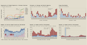
Looking first at the “usual” suspect of populism and anti-system party activity—which might suggest regime-type instability—one can see a clear uptick in parts of Europe. Hungary and Poland are unsurprising stars in this field, but I didn’t expect to see Italy outperforming either of them. An important note on that is that in Poland, most of the popularity shares fall to a single party, whereas in Italy anti-system sentiment is split between the Five Star Movement and Northern League. While both are heterodox, they are more competitors than compatriots. In Hungary, there are also two popular parties, but Fidesz maintains a solid grip on power.
While the later years of the figure don’t look good at first, I’m actually somewhat encouraged by them. Back in 2016, coming out of the Eurozone crisis, Donald Trump’s election in the United States, and some anti-system gains in parts of Europe, there was widespread panic that a populist surge was about to envelop the rest of Europe. Seeing how that failed to materialize even in a country like Greece, an epicenter of that economic crisis, is a little reassuring.
However, this chart doesn’t quite communicate the scale of democratic dismantling that’s taken place in Hungary, for example, so threats to democratic stability in Europe remain and are very real. How a westward-looking and awake Russian bear will affect domestic politics in Europe isn’t clear, but it’s likely a smart bet that we’ll see increased talk about European strategic independence from the US. In fact, Germany has already announced a plan for €100bn of new military spending. It will be difficult for the European Union to handle the strain of being pulled in opposite directions by members like France and Hungary who want a tighter and more powerful or looser and less effective EU, respectively.
More about this chart:
The data featured in this chart are drawn from a University of Zurich project compiling political activity statistics. If you want to learn more about other countries we did not include or about how the researchers categorized political parties, you can do so here.
Armingeon, Klaus, Sarah Engler and Lucas Leemann. 2021. Comparative Political Data Set 1960-2019. Zurich: Institute of Political Science, University of Zurich.
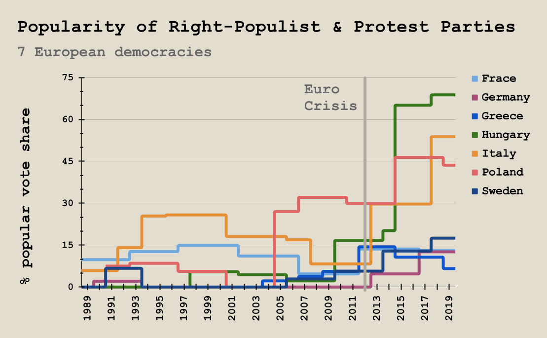
Similarly to anti-system party popularity growth, the 2010s saw a huge uptick in large-scale protest activity in Europe and North America. It’s disappointing that this dataset ends at 2019, as I imagine the protests in the summer of 2020 would reflect a sizeable increase.
The 2010-2012 situation is pretty easily explained, I think, by the financial crisis and Great Recession, as I marked on the chart. However, I’m at a loss over the 2015-2019 steady increase in protest activity. It could be anti- or pro-populist activity, or it could be a whole host of different causes and motivations.
Regardless, protests are on the rise in the west, but that could be taken two ways. On the one hand, protest can be seen as a sign of a thriving civil society with a dedicated and engaged public. On the other, it is sometimes a sign of deep social illness rather than health, such as police or state-sanctioned brutality, economic woes, or political corruption. Though it’s often a sign of both, when protest becomes so ubiquitous—and violent—it’s usually an indication of the latter.
The ‘90s and ‘00s look healthy, though, in that they see frequent bursts of activity that quickly subside. To me, this suggests that an engaged civil society mobilized when there were problems and were more often met with changes or solutions from governments. It could also mean that people were just less engaged, although that too could be a good sign that fewer people had serious social or political grievances.
More recently, these large, prolonged periods of intense civil activity are not very promising for order and democracy. If people are in the streets year after year in increasing numbers each year, that is a bad sign, likely meaning those people feel their problems are not being addressed or that the typical method for impacting politics (voting) doesn’t suffice.
More about this chart:
These data come from the Mass Mobilization Data Project at Harvard University. One important note: they classify a protest as being violent which has any violence at all committed by protestors. You may or may not think that’s a good threshold, but it’s what I’ve got. If you want to take a closer look at the data and learn more about how and why the researchers categorized certain information, you can do so here.
Clark, David; Regan, Patrick, 2016, "Mass Mobilization Protest Data", https://doi.org/10.7910/DVN/HTTWYL, Harvard Dataverse, V5, UNF:6:F/k8KUqKpCa5UssBbL/gzg== [fileUNF]
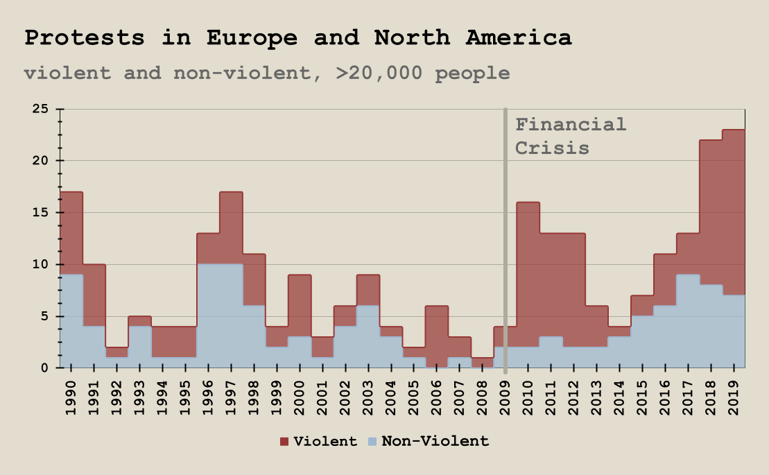
This chart is one I’ve been thinking about for a while. I first mentioned these coup frequency statistics in an article about the coup in Sudan last year, and I still think it’s very bad news, especially considering 2022 has already seen another successful coup d'état in Burkina Faso.
Now, this is obviously from a different angle, as the previous two figures looked exclusively at the west, while this considers the entire world. That’s because different activities are useful predictors and markers of political stability and instability in different parts of the world. Obviously very few coups have been attempted since the ‘90s in Europe and America, so one has to look for more subtle signs, but coups do happen in other places more often.
2015-2020 offered a period of remarkable stability I certainly failed to recognize at the time, and I think most other people did too. Unfortunately, though, the coup d'état is definitely back. Most of this activity is taking place in Africa, and there, as I’ve written before, I do think it’s a symbol of shifting spheres of influence. As China moves more resources into the region, militaries may well be emboldened by lowered costs, knowing their juntas can get the same (or better) outside funding and investment from Beijing as the young democracy may have from the US and Europe.
This kind of shift in global power distribution is an especially disturbing portent of future instability. As alternative spheres of influence grow, they’re bound to push up against the west’s, first as a nuisance and later as something seemingly existential. The current invasion of Ukraine is an obvious marker of one power taking action to enlarge its own power and sphere. I’m inclined to think that we’re entering a time in which there will be many more like it soon.
More about this chart:
These data are sourced from the ‘Global Instances of Coups’ project by Jonathan Powell and Clayton Thyne. If you’re inclined to learn more about this research, you can do so here.
Powell, Jonathan & Clayton Thyne. 2011. Global Instances of Coups from 1950-Present. Journal of Peace Research 48(2):249-259.
War and Death
Moving on from political stability or lack thereof, no look at order in the world would make any sense without a consideration of war, and here things may look even worse.
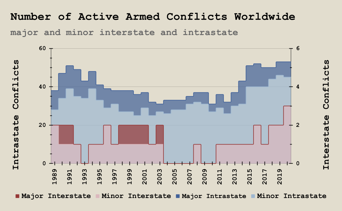
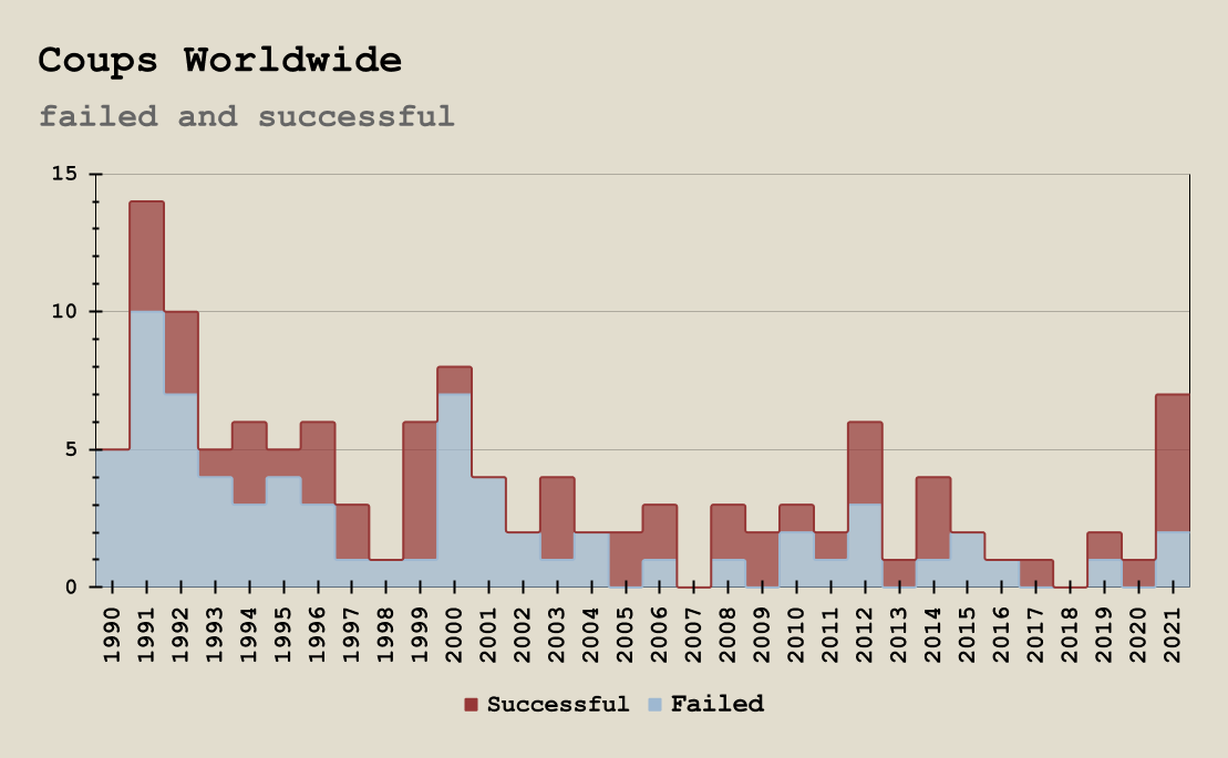
This chart looks particularly bad, but I’ll explain a couple terms here up front. Interstate conflict is conflict that takes place where at least one party involved is a country engaged in conflict beyond its own borders. Intrastate takes place entirely within the borders of a particular country, without any other country being involved. The numbers of major and minor conflicts of each type are stacked to reflect totals, but interstate and intrastate are just overlaid visually—there are different scales for both types of conflict. I hope it’s not too confusing.
There’s an obvious increase from about 2010 on, but unlike with protest activity, there’s no leveling off or decline here. Instead, both inter- and intrastate conflict have been on the rise for the past decade with no obvious end in sight.
It seems some small consolation at least major interstate conflict hasn’t picked up, until one realizes that this chart ends with 2020, leaving off the invasion of Ukraine, the first major interstate conflict since America’s invasion of Iraq in 2003. Even without that, the growth of minor interstate conflicts wouldn’t seem all that promising, given that battles are usually preceded by skirmishes.
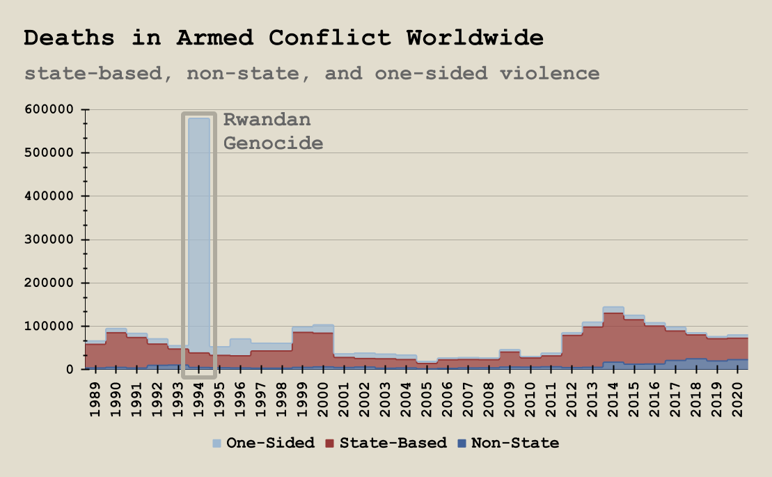
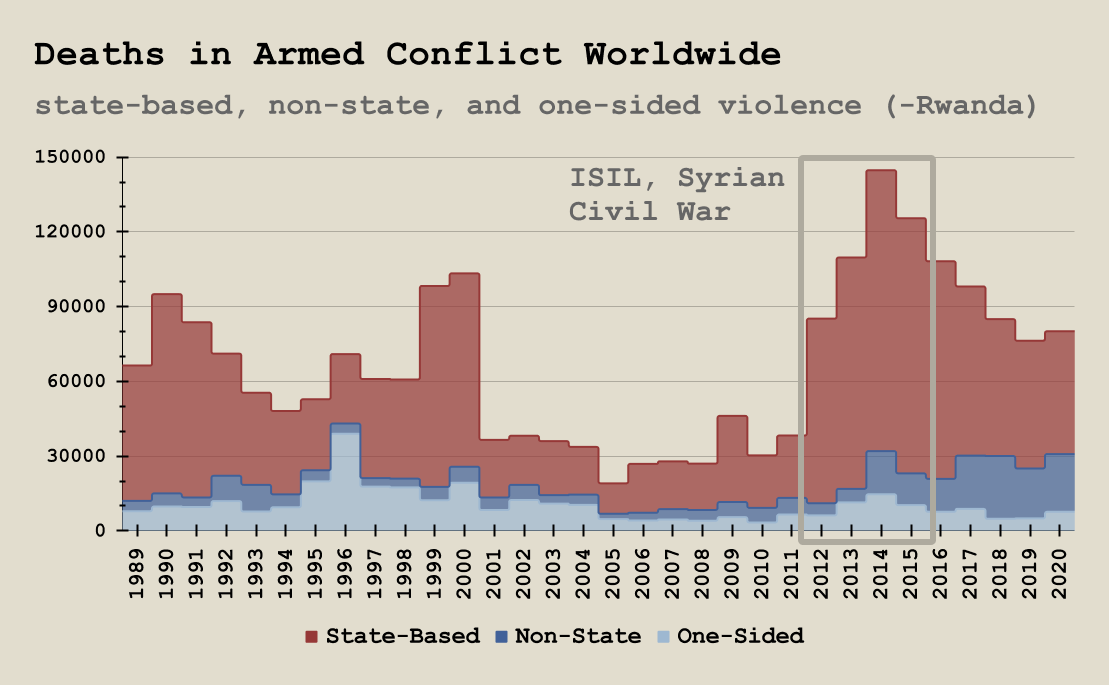
Looking at the number of deaths caused by armed conflicts, however, tells a slightly different story. In the first chart, there’s obviously a massive single-year spike, which represents the 1994 Rwandan genocide. Given how much it skews the data, taking it off—without forgetting its horror or significance—yields a much more helpful and generally accurate picture.
On the number of conflicts chart, 2012-2015 saw a dramatic uptick, and here that’s mirrored closely. A considerable portion of those deaths come from the rise of the Islamic State and the Syrian civil war, and increasing terror activity in that region would also explain some of the growth of conflicts.
However, even as the number of conflicts remain steady or even increase, the proportion of major conflicts decreases. As a result, fewer people are dying. I suppose it’s a little encouraging to see that even if wars become more frequent, they may be smaller and less deadly.
More about these charts:
These three charts use data sourced from the Uppsala Conflict Data Program. There’s a lot of little details about what counts as a minor or major conflict, what the different types of conflict are, and how deaths are counted as related to conflict. To learn more about any of that, click here. The program also has a pretty good website with more ways to visualize this information.
Pettersson, Therese, Shawn Davis, Amber Deniz, Garoun Engström, Nanar Hawach, Stina Högbladh, Margareta Sollenberg & Magnus Öberg (2021). Organized violence 1989-2020, with a special emphasis on Syria. Journal of Peace Research 58(4).
Eck, Kristine & Lisa Hultman (2007) Violence Against Civilians in War. Journal of Peace Research 44(2).
Sundberg, Ralph, Kristine Eck and Joakim Kreutz (2012) Introducing the UCDP Non-State Conflict Dataset. Journal of Peace Research 49(2).
Gleditsch, Nils Petter, Peter Wallensteen, Mikael Eriksson, Margareta Sollenberg, and Håvard Strand (2002) Armed Conflict 1946-2001: A New Dataset. Journal of Peace Research 39(5).
As always, it’s impossible to tell where the world is headed. While I think that cynicism has some value, especially in protecting one from disappointment, it can also delude us into thinking we already know things we really aren’t even close to understanding.
I don’t know exactly what to make of all the data I’ve presented. Some of it—such as populist popularity and the decrease in conflict-related deaths—is promising. A lot of it isn’t. While I know it’s frustrating to get to the end of an article like this and be met with something of a shrug, I think we might all be a little better off if more did the same. I’m no stranger to opining, but I really only see one conclusion from all of this: that the world is probably about to get a lot less predictable, not moreso.
Subscribe to Spectacles
Comments
Join the conversation